Choosing the right bedroom color ideas sounds simple until you’re standing in a hardware store under fluorescent lighting, holding 400 swatches and suddenly unsure whether you want “Coastal Mist” or “Morning Fog.” The real problem isn’t the number of choices; it’s not knowing how those colors will actually perform on your specific walls, in your specific light.
Here’s what makes 2026 different: the palette has genuinely shifted. The cool gray-on-gray era that dominated the 2010s is over, and what’s replaced it is warmer, earthier, and more layered. At Source Passion, bedroom decor questions are among the most common we get, and color is always where it starts. This guide gives you specific shades, not just vague color families, so you can walk into your local Home Depot, Sherwin-Williams, or Benjamin Moore retailer with a real shortlist.
By the end of this article, you’ll know which direction fits your room, which exact shades to sample, and what to do before you commit to a full can.
Bedroom Color Ideas: 2026 Trends Worth Knowing Right Now
The best way to narrow down your options is to locate your style instinct first. The 2026 bedroom palette breaks into three clear clusters, and understanding the mood each creates helps you self-select before you ever look at a swatch.
Warm neutrals and earthy tones are dominating
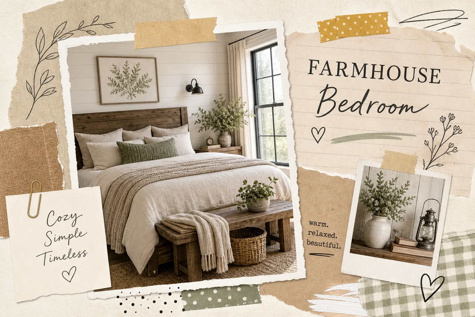
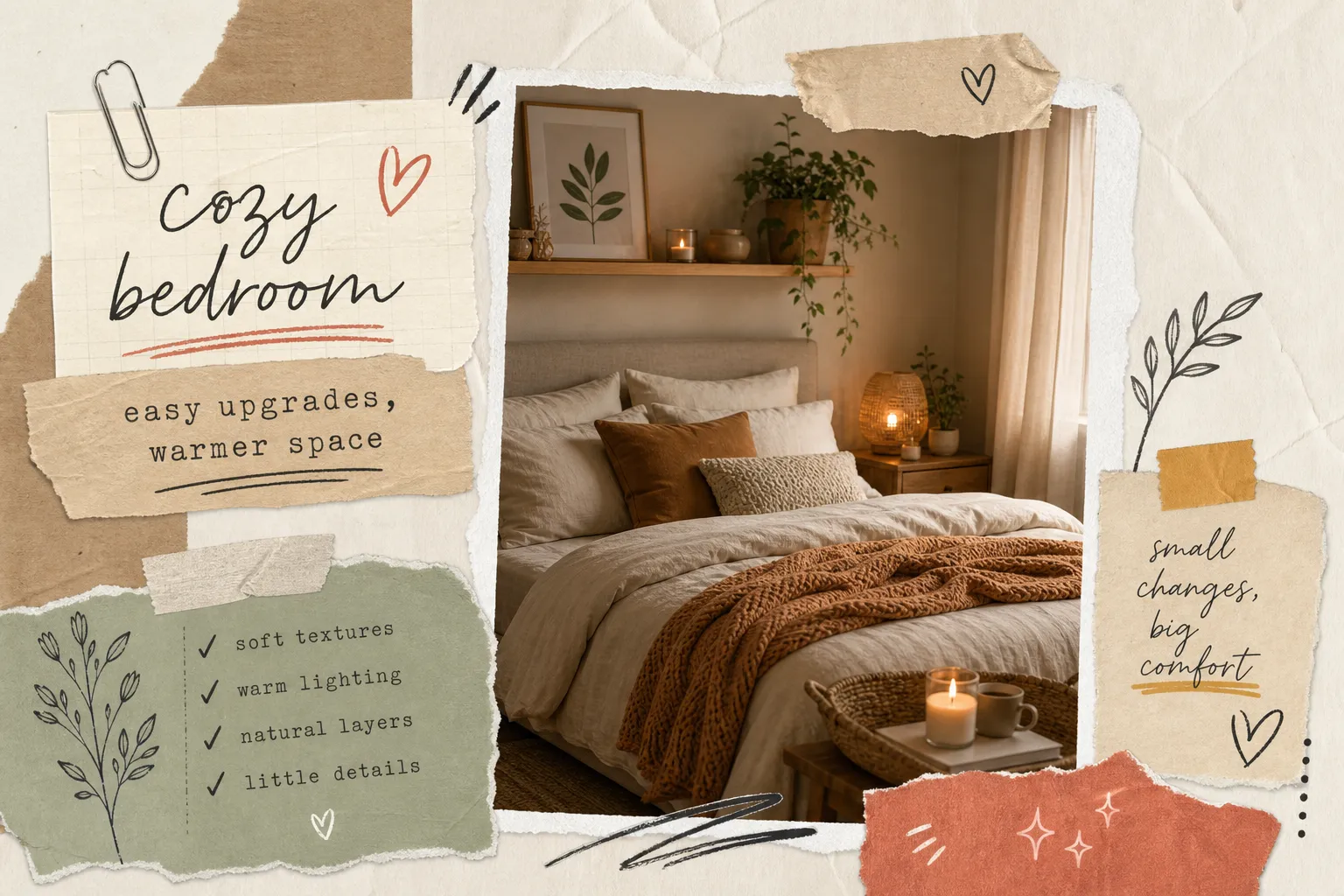
The shift away from cool grays toward creamy whites, warm beiges, dirty chai browns, and clay tones is the defining move in 2026 bedroom color ideas. These shades create rooms that feel grounded, layered, and genuinely cozy rather than sharp or clinical. Warm greige, oatmeal, and burnt umber are showing up in master bedrooms and smaller guest rooms alike, often paired with natural wood furniture and linen textiles. If you want a room that feels like a retreat rather than a showroom, this cluster is where to start.
Botanical greens as the mood-reset color
Sage, eucalyptus, and deeper forest greens are the standout bedroom color direction for 2026. Green works exceptionally well in sleep spaces because of its association with nature and its low visual stimulation, your eye doesn’t have to work hard to process it. Lighter sage reads airy and spa-like, which suits minimalist or Scandinavian-style rooms. Deeper botanical green creates a more dramatic, cocooning effect, similar to what you’d find in a boutique hotel room. Both work; the choice depends on how enveloped you want to feel.
Muted blues, blush, and soft lavenders
At the quieter end of the 2026 palette, you’ll find airy blue-grays, soft blush pinks, and pale lilacs. These are calming bedroom colors precisely because they’re muted rather than colorful, there’s no visual punch, just a gentle tonal presence. They bring a spa-like quality to master bedrooms and work well when you want a finished room that feels serene without fully committing to a neutral. Think of them as an easy entry into color without the commitment.
Calming Bedroom Color Palettes Backed by Color Psychology
Trends are useful, but understanding why certain colors support sleep and relaxation makes your final decision far more intentional. For a deeper dive into how color affects sleep, see this resource on bedroom color psychology and its impact on sleep.
Why muted tones outperform bright ones for better sleep
Highly saturated, warm-spectrum colors, reds, oranges, and bright yellows, stimulate the nervous system rather than quiet it. Muted cool tones and low-contrast warm neutrals reduce visual stimulation, which directly supports the wind-down process your brain needs before sleep. The takeaway is straightforward: choose colors that don’t compete for your attention.
Three ready-made palette combinations that promote rest
- Soft blue-gray walls + creamy white trim + pale gray textiles, airy and tranquil; suits minimalist and modern bedrooms where clean lines matter.
- Sage green walls + warm off-white trim + light taupe accents, grounded and natural; works especially well in rooms with wood furniture or rattan accents.
- Warm ivory walls + blush textiles + muted sand bedding, gentle and romantic; suits master bedrooms where a soft, enveloping feel is the goal.
Colors that quietly undermine the relaxing vibe
High-saturation accent walls in red or orange bring energy that’s hard to wind down against, save those for home offices. Very bright whites can feel clinical rather than calm if the room lacks warm accessories to balance them. Cool-toned grays without warm furniture or textiles often read stark and hollow rather than sophisticated. The fix in each case is the same: shift toward warmth and lower contrast.
How Your Room’s Light and Size Should Shape Your Final Pick
This is the step most bedroom color guides skip, and it’s where most mistakes happen. A shade that looks perfect on a sample strip can look completely different on your north-facing wall at 7 a.m.
North-facing bedrooms: why warm undertones matter
North-facing rooms receive cooler, bluer, more diffused natural light throughout the day. Without correction, even a paint labeled “warm neutral” can read cold and flat on these walls. Shades with yellow or red undertones counteract that effect. Greek Villa SW 7551 (a creamy warm white from Sherwin-Williams) and Worldly Gray SW 7043 (a soft greige) are both strong choices for north-facing rooms. Higher-LRV shades are also worth prioritizing here because they bounce more of the limited natural light back into the space.
South-facing and larger bedrooms: more flexibility, new considerations
South-facing rooms get warmer, brighter light for longer parts of the day, which means most colors perform well. Very warm shades, however, can feel overwhelming by midday when the light is at its peak. Larger rooms introduce another challenge: the color on the wall closest to the window may look noticeably different from the wall on the opposite side. The practical fix is to test your sample swatches on multiple walls and observe them at different times of day before committing.
Bedroom color ideas for small rooms
Small bedrooms benefit from lighter, higher-reflectance shades that bounce light and make the space read larger. This doesn’t mean white-only, pale sage, soft blush, and light warm beige all open up a small room without feeling sterile. Avoid dark accent walls unless the room has excellent natural light and a clear focal point that justifies the contrast.
Bold Accent Wall Colors That Still Feel Cohesive
If a full-room color feels like too much commitment, a single accent wall is the practical alternative. Done right, it anchors the room and adds dimension without overwhelming the space.
Which wall to accent and why it matters
In a bedroom, the wall behind the headboard is almost always the right choice for an accent wall. It anchors the room’s natural focal point, the bed, and creates a visual backdrop that makes the furniture feel intentional. Other walls can work if there’s a strong architectural reason (a fireplace wall, a window niche), but the headboard wall is the default for good reason.
2026’s standout accent wall shades for bedrooms
The most compelling accent wall directions for 2026 are specific and confident:
- Deep forest green (try Sherwin-Williams Evergreen Fog SW 9130), cocooning and sophisticated; suits modern, organic, and quiet-luxury bedroom styles.
- Inky blue-gray (Benjamin Moore Hale Navy HC-154 is a reliable benchmark shade), a classic moody statement; works best in rooms with warm wood tones and white trim.
- Warm terracotta or clay, earthy and grounded; suits bohemian and warm-modern rooms with natural texture.
- Cordovan or oxblood (Sherwin-Williams Cordovan from the 2026 HGTV collection), richly luxurious without feeling aggressive; pairs well with soft neutrals and linen.
Tying your accent wall back to bedding, furniture, and trim
The most common accent wall mistake is treating it as isolated from the rest of the room. Pull one color from your accent wall into at least one textile, a throw pillow, a blanket, or a lampshade, and the room shifts from “someone painted a wall” to “someone designed a room.” For trim, standard bright white works cleanly with any of these accent shades. Greige or off-white trim softens the contrast and creates a cozier boundary, especially in rooms with warm-toned walls.
Exact Paint Shade Picks from Top US Brands
Here are the specific shade names to bring to your paint counter, organized by color family.
Sherwin-Williams bedroom-ready shades for 2026
- Greek Villa SW 7551, warm white with creamy undertones; ideal for north-facing rooms and rooms that need warmth without color.
- Acacia Haze SW 9132, soft green-gray; a versatile botanical that reads sage in warm light and gray-green in cool light.
- Neutral Ground SW 7568, warm greige; a natural successor to Agreeable Gray for bedrooms that want a layered neutral.
- Fawn Brindle SW 7640, warm medium brown; for anyone ready to commit fully to the earthy 2026 direction.
- Evergreen Fog SW 9130, the go-to designer sage for accent walls and full-room applications in 2026.
- Universal Khaki SW 6150, Sherwin-Williams’ 2026 Color of the Year; a warm, earthy khaki that bridges the neutral and earthy tone categories.
Benjamin Moore and Behr options worth sampling
Benjamin Moore’s strongest bedroom offerings this year include October Mist 1495, a soft gray-balanced sage that reads calm in warm light; Saybrook Sage HC-114, a soothing aloe hue cooled with gray; and Silhouette AF-655 for a bold, quieter-luxury direction. Behr is a practical entry point worth considering: it’s carried at Home Depot, sample pots are affordable, and shades like Willow Leaf and Sage Gray track closely with the Benjamin Moore palette. No cross-brand exact match exists because pigment bases differ between manufacturers, so use these names as starting points and test them physically in your room.
Choosing the right paint finish for bedroom walls
The finish affects both how the color looks and how the walls hold up over time. Here’s the short version:
- Matte: Best for a calm, luxurious look; hides wall imperfections well; less washable than other finishes.
- Eggshell: The best all-around bedroom finish for most homes, low sheen, moderately cleanable, and works for nearly every adult bedroom.
- Satin: Best for kids’ rooms or high-wear spaces; more washable but shows wall imperfections more readily.
The practical rule: choose eggshell for most adult bedrooms. Step up to satin only if the room gets heavy use or you anticipate cleaning the walls regularly.
Beyond the Walls: How to Finish Your Bedroom Transformation
The paint color is the foundation, but it’s not the whole room. Getting the walls right creates the backdrop, everything else is what makes it feel finished.
Testing samples before you commit to a full can
No color guide replaces testing a physical sample in your specific room. Buy a sample pot (most US retailers sell them for under $5), paint a 12-by-12-inch swatch directly on the wall, and observe it in morning light, afternoon light, and evening artificial light before buying a full gallon. This single step prevents the most common and frustrating outcome: realizing your color looks wrong only after the walls are fully painted.
Coordinating trim, ceiling, and accent pieces with your new color
Standard bright white trim works cleanly with almost any wall color and is the safe default. Softer off-white trim creates a cozier, quieter boundary in rooms with warm-toned walls. For the ceiling: extending your wall color upward makes small rooms feel larger and more enveloping. Keeping the ceiling white in rooms with dark or bold walls prevents a cave effect. For accent pieces, echo the wall color without matching it exactly, a sage green wall pairs naturally with eucalyptus-toned ceramics or a muted olive throw rather than a matching sage pillow.
What comes next after the paint dries
Getting the wall color right is step one. The rest of the room, bedding layers, lighting choices, furniture placement, and decor accents, is what makes a bedroom feel genuinely pulled together rather than just freshly painted. Source Passion’s bedroom decor guides cover exactly that: how to choose the right bed frame and headboard, how to layer textiles for depth, and how to pick lighting that works with your new palette rather than fighting it. If you’re ready to move past the paint, those guides are the natural next step.
The Short Version Before You Go Shopping
The best bedroom color scheme isn’t the most on-trend one, it’s the one that fits your room’s light conditions, your desired mood, and your existing furniture. The 2026 palette gives you genuinely strong directions to work with: warm neutrals, botanical greens, and muted blues and blushes are all well-supported by both trend data and color psychology.
Before you head to the store, narrow your bedroom color ideas down to one direction from those three clusters, then grab two or three sample pots from Sherwin-Williams, Behr, or Benjamin Moore and test them on your actual walls at different times of day. Choose eggshell finish for most adult bedrooms, confirm your trim and ceiling plan, and you’re ready. The room you’ve been picturing is closer than it looks under those store lights.